- Role
- UI/UX Designer · Web Designer
- Timeline
- 2026
- Duration
- 2 week
- Tools
- Figma, FigJam, DaFonts
Noor Consultancy Redesign
The Challenges
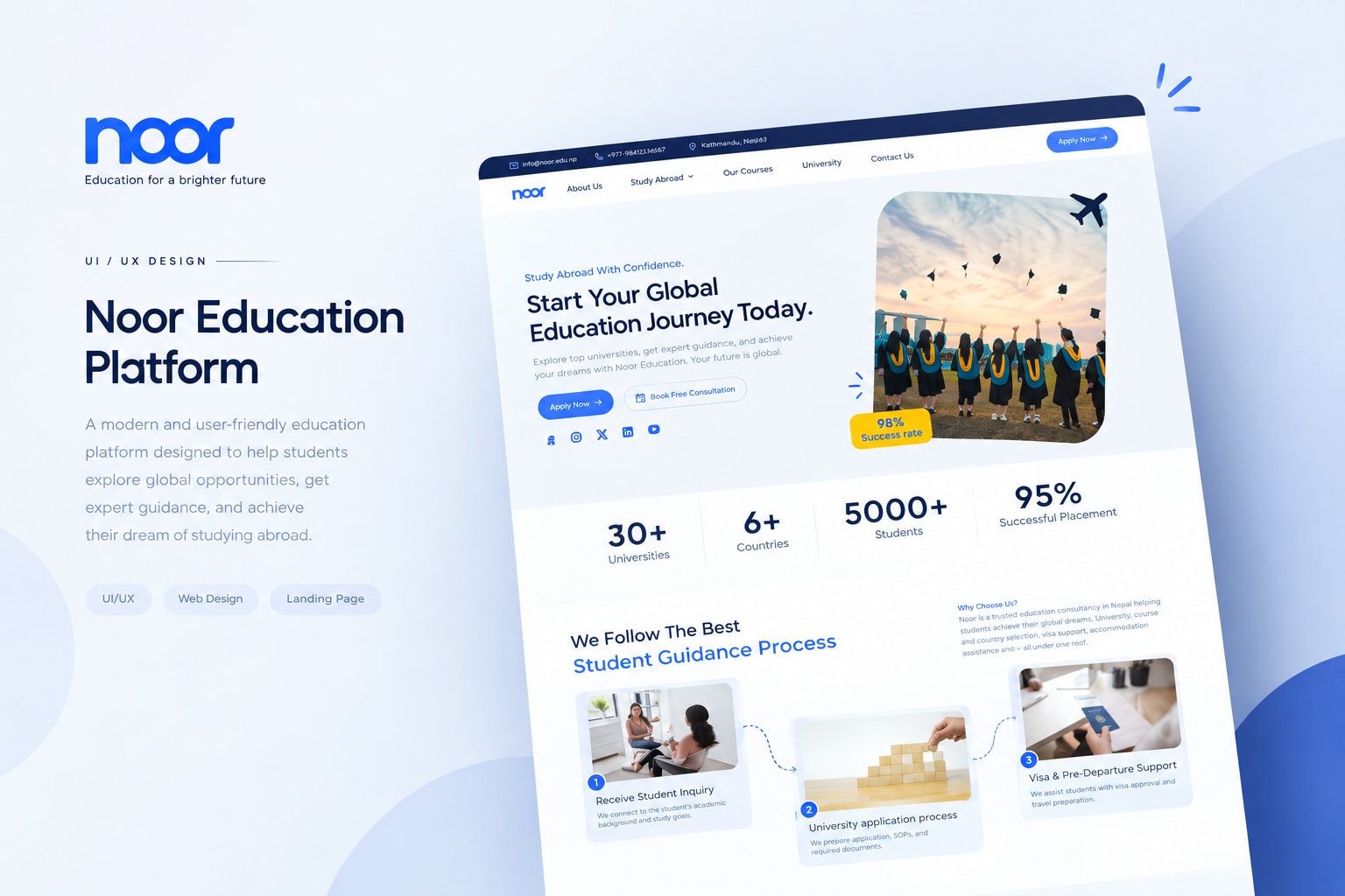
Students looking for study-abroad opportunities often need to navigate through a large amount of information, from destinations and universities to courses, applications, visa requirements, and consultation services.
The goal of this redesign was to create a more structured and approachable experience that helps students understand Noor's services quickly and confidently.
Designing for Clarity & Confidence
The redesign focused on simplifying the experience while giving Noor a stronger and more professional digital presence.
The goal was to make important information easier to discover, improve the visual hierarchy, and guide students naturally from exploring their options to taking the next step.
Design Goals
- Simplify the navigation experience.
- Establish a stronger visual hierarchy.
- Make study-abroad information easier to scan.
- Build trust through statistics, universities, and student experiences.
- Create clear calls-to-action,
- Improve the overall responsive experience.
- Translate the final design into a functional website.
From Exploration to Application
Instead of treating the website as a collection of independent pages, I structured the experience around the journey a student typically takes when considering studying abroad.
The journey
- 01. Discover: Students explore destinations, universities, courses, and opportunities.
- 02. Understand: They learn about admissions, visa assistance, and available guidance.
- 03. Build Trust: Statistics, partner universities, and student experiences provide supporting information.
- 04. Take Action: Clear calls-to-action encourage students to apply or book a consultation.
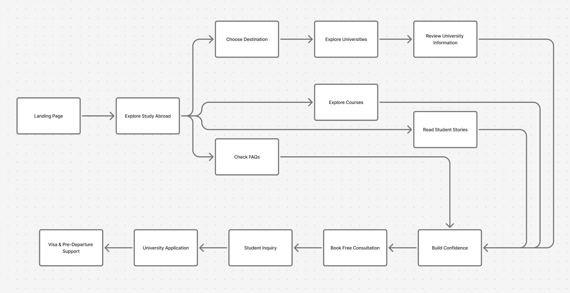
User flow diagram
Structuring the Experience
I organized the content around the information students are most likely to look for when exploring study-abroad opportunities.
- Home
- About Noor
- Study Abroad
- Courses
- University
- Student Experience
- FAQS
- Consultaion
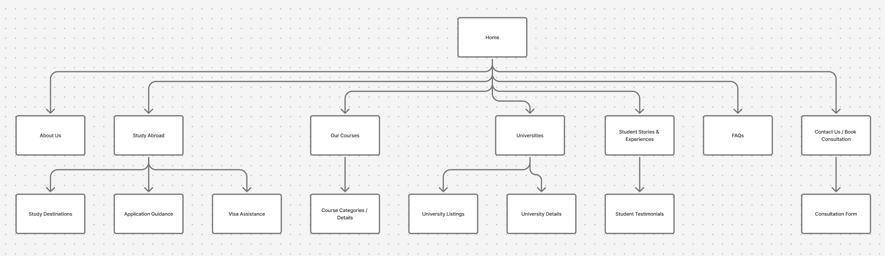
Website Sitemap
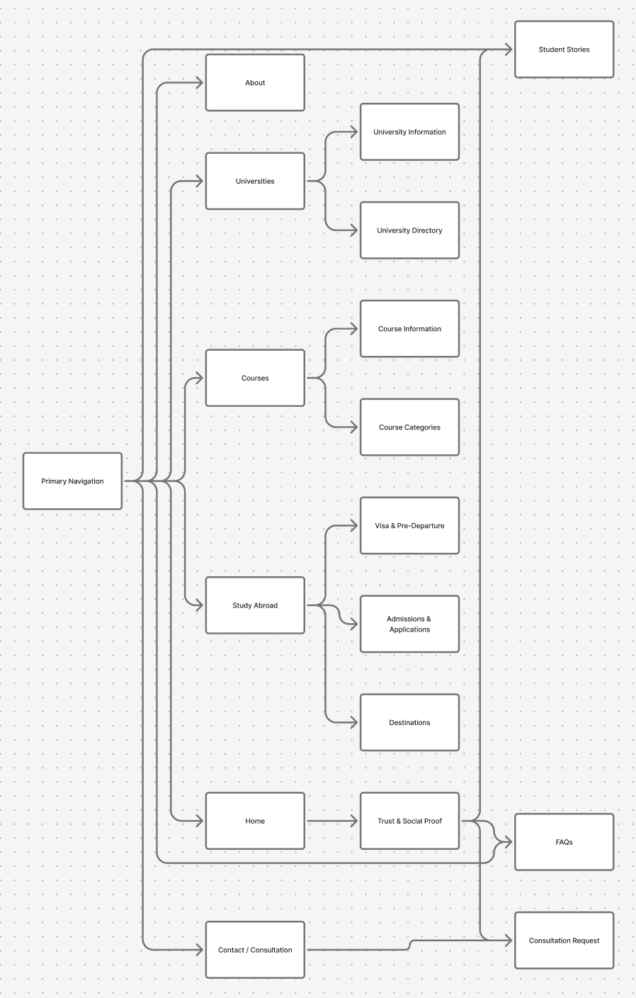
Architecture-design
A Clearer First Impression
The homepage was redesigned to immediately communicate what Noor offers and where students can go next.
The hero section introduces the study-abroad proposition with clear calls-to-action, followed by credibility indicators, the student guidance process, destinations, university information, student experiences, FAQs, and consultation.
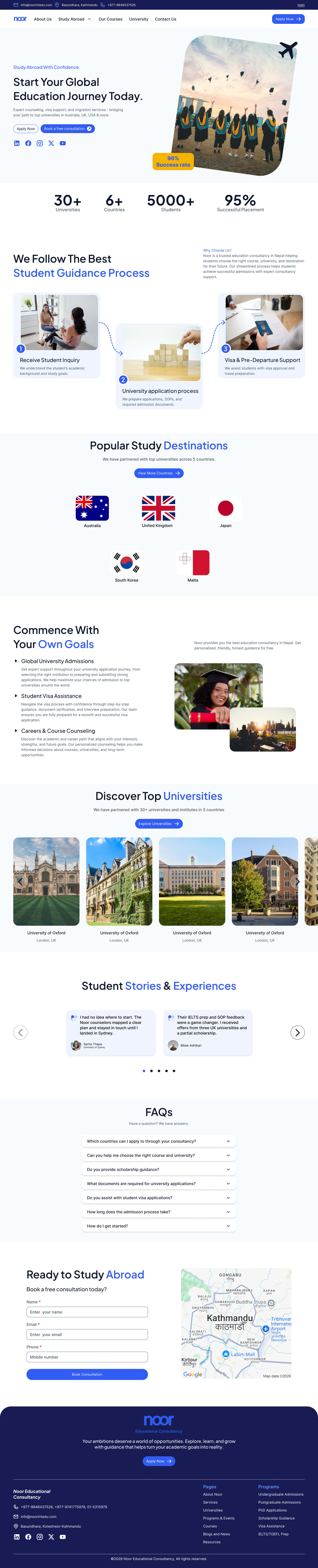
Full design preview
Communicating the Value Immediately
The hero section was designed to answer three questions quickly: What does Noor do? Who is it for? What should the student do next?
A strong headline, supporting description, primary CTA, secondary consultation CTA, and supporting success-rate visual establish the purpose of the website without overwhelming the user.
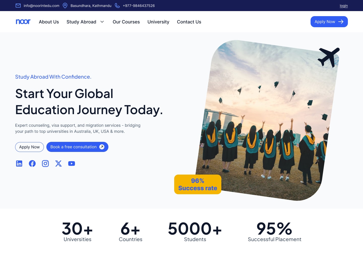
Hero section
Designing for Trust
For an education consultancy, trust plays an important role in the decision-making process. I introduced multiple credibility points throughout the page rather than relying on a single section to communicate trust.
- Universities
- 30+Universities
- Countries
- 6+Countries
- Students
- 5000+Students
- Success Rate
- 95%Success Rate
Turning a Complex Process Into Simple Steps
The study-abroad process can feel complicated, especially for students experiencing it for the first time. I transformed the process into three visual steps so users can understand how Noor supports them from the initial inquiry to pre-departure.
- 01. Receive Student Inquiry: Understand the student's academic background, interests, and study goals.
- 02. University Application Process: Support students with applications, SOPs, and required admission documents.
- 03. Visa & Pre-Departure Support: Provide guidance throughout visa preparation and travel planning.
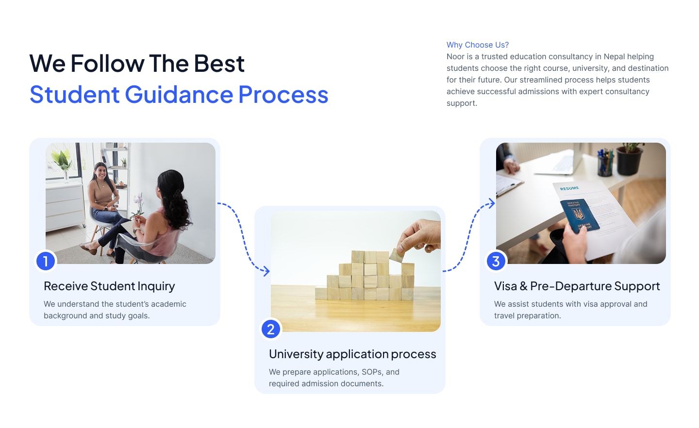
About us section
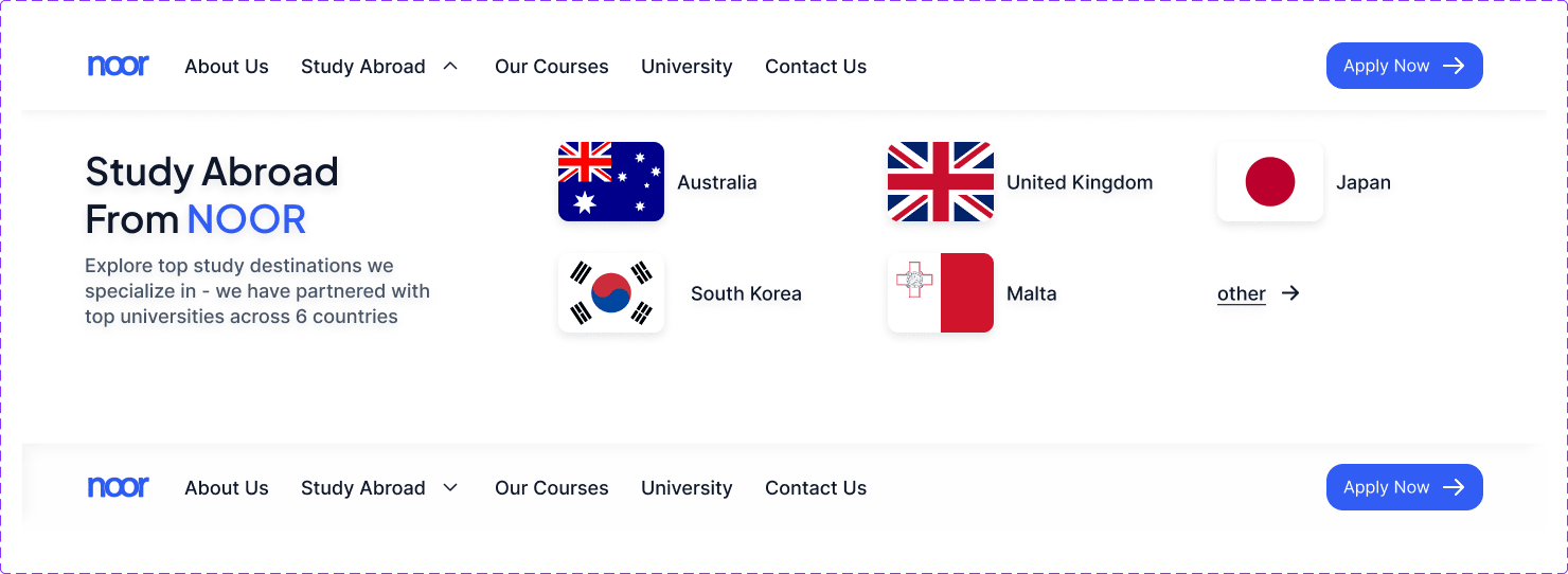
Making Destinations Easy to Explore
Popular study destinations were presented visually using country flags and a focused layout. This gives students an immediate overview of the countries Noor supports while providing a clear path toward exploring more destinations.
- Australia
- United Kingdom
- Malta
- Japan
- South Korea
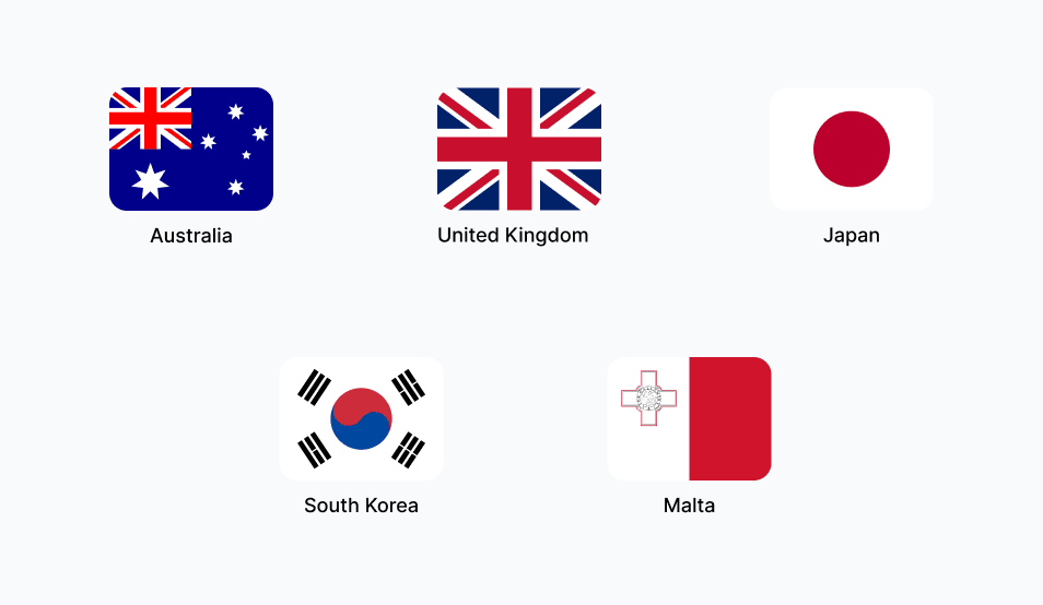
Destination section
Guiding Students Toward Their Goals
The services section was structured around the key areas where students need support throughout their study-abroad journey.
- Global University Admissions
- Student Visa Assistance
- Careers & Course Counseling
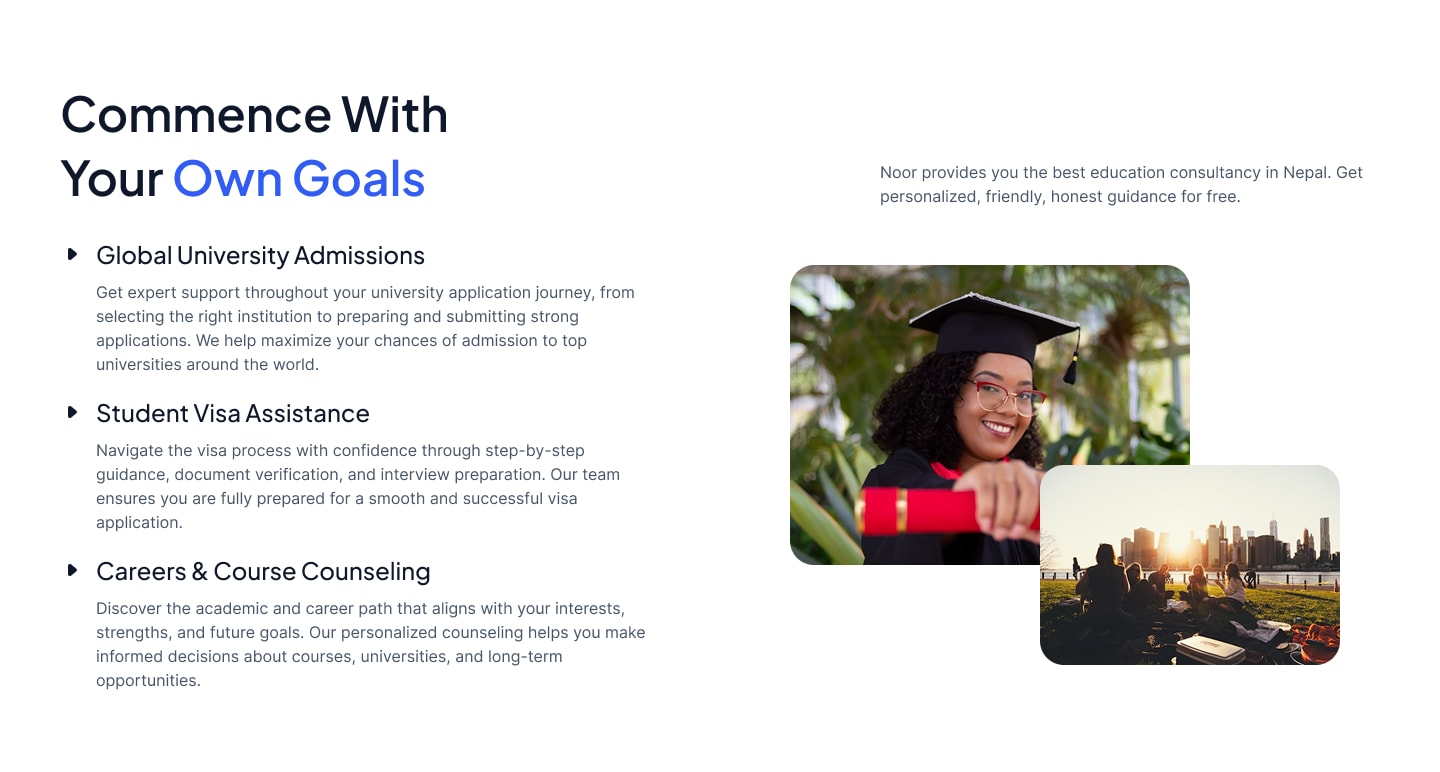
Goals Section
Helping Students Explore Their Options
University cards were introduced to make partner institutions easier to browse and recognize. The visual card layout allows users to quickly identify the university, location, and supporting imagery.
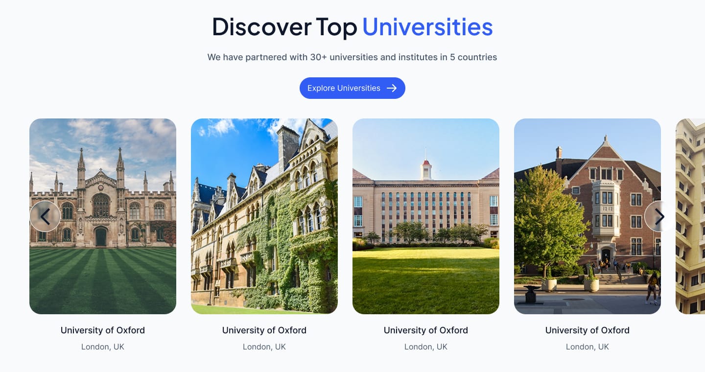
Universities section
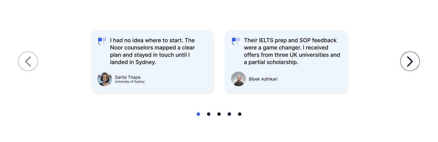
Adding Real Experiences to the Journey
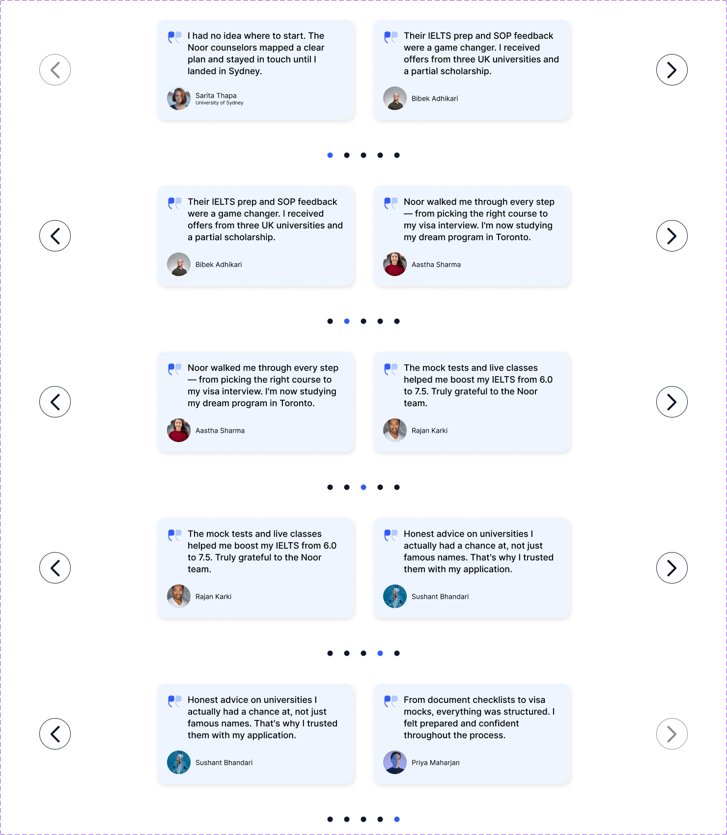
Student testimonials were incorporated to add a human element to the experience. Rather than presenting the consultancy only through services and statistics, the section gives students an opportunity to see experiences from people who have gone through the process.
Testimonials section
Answering Questions Before They Become Friction
Study-abroad decisions come with many questions. The FAQ section organizes common concerns into an expandable format so users can find answers without making the page feel overwhelming.
Examples:
- Which countries can I apply to?
- How do I choose a university?
- Do you provide scholarship guidance?
- What documents are required?
- Do you assist with student visas?
- How long does the admission process take?
- How do I get started?
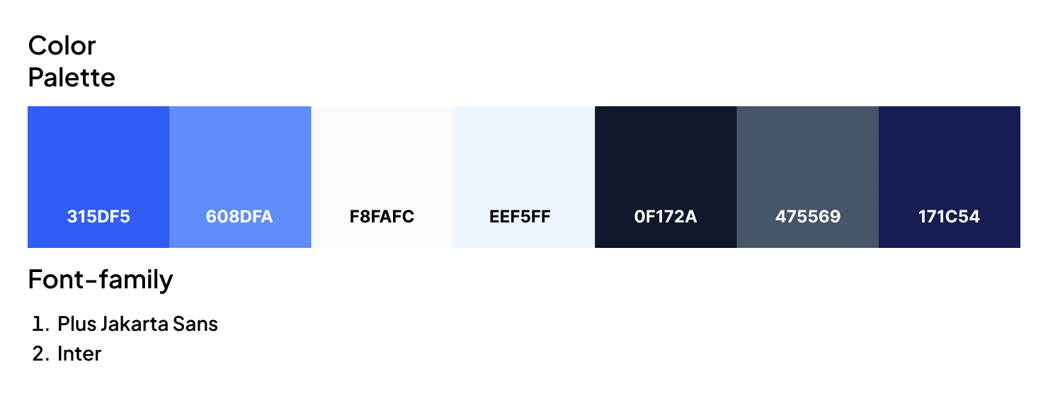
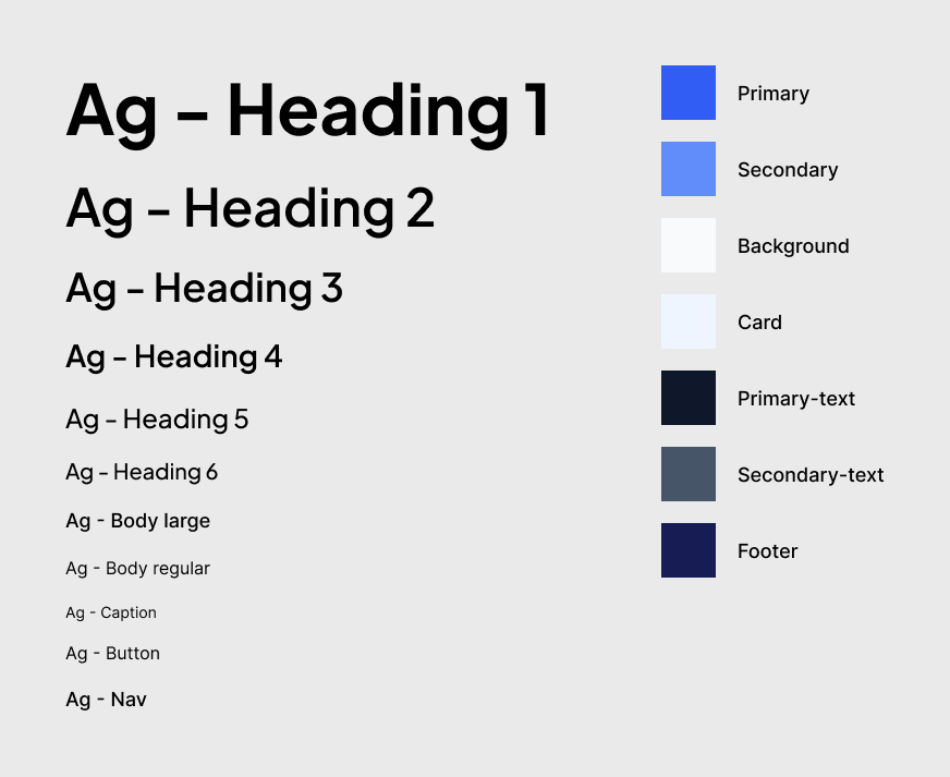
Visual Language
I created a simple visual system designed to communicate professionalism, trust, and accessibility while maintaining a modern education-focused aesthetic.
Fonts and color Palette
Typography and Colors
navbar
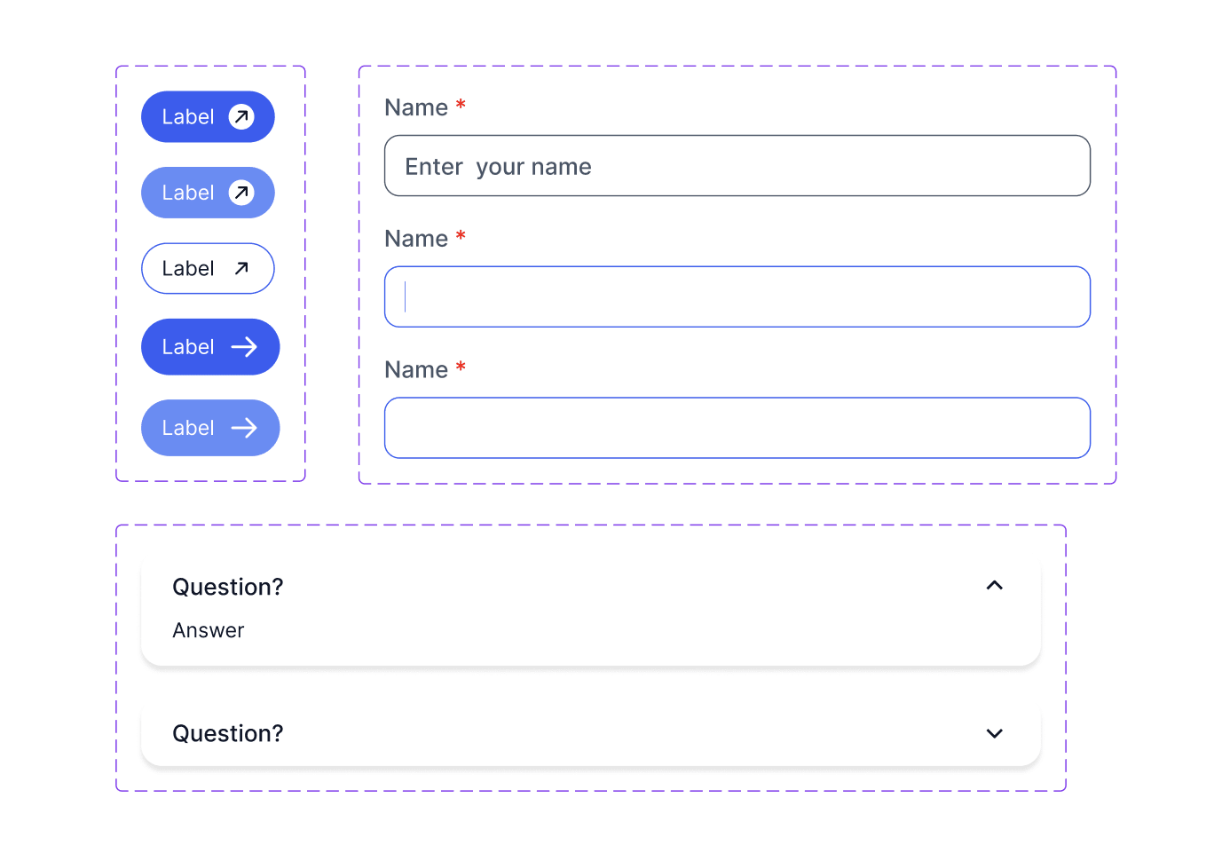
components
What I Learned
This project helped me understand how important information hierarchy is when designing for users who are making an important decision. Rather than focusing only on visual aesthetics, I learned to structure content around the user's journey and gradually build confidence through information, social proof, and clear actions.
It also gave me an opportunity to take a project from design to development, allowing me to experience the challenges of translating a Figma design into a responsive, functional website.